
Creating Effective Ad Banner Animations for Web
Explore timing, easing, and attention-grabbing techniques that drive clicks with responsive animations optimized for desktop and mobile displays.
Master platform-specific motion requirements. Learn vertical format constraints, trending transition styles, and how to hook viewers in the first second.
Written by
Editorial Team focused on practical, clearly explained guidance for motion design and social media animation.
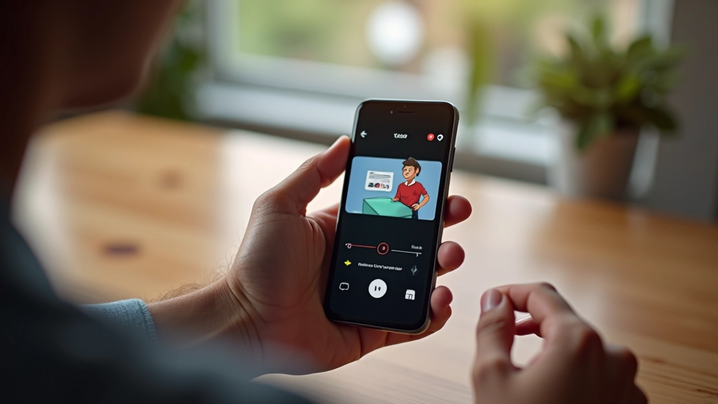
Short-form video isn’t just a smaller version of traditional motion graphics. It’s a completely different beast. TikTok and Instagram Reels live in the thumb-scroll zone — literally. Users swipe through dozens of videos in minutes. If your animation doesn’t grab attention in the first frame or two, you’ve lost them.
The vertical format changes everything. Your composition, timing, and visual hierarchy all need to shift. We’re talking about 9:16 aspect ratios, thumb-friendly UI placement, and motion that works in silence (most users scroll with sound off). That’s not a limitation — it’s an opportunity to design something genuinely different.

Here’s the reality: most users decide whether to keep watching in less than a second. That’s faster than you’d think. On TikTok specifically, the algorithm favors videos with high “watch time” and low “skip rate.” If people bounce in the first frame, you’re done.
Your opening motion needs to work harder. It can’t be subtle or slow to build. A quick cut, a sharp zoom, a color burst — something that signals “this is worth your time.” Think about motion that’s almost jarring. Not unpleasant, but definitely noticeable.
We’ve seen this pattern across successful accounts: the best-performing videos almost always have immediate motion in the first frame. A face, a shape, text that slides in. Movement that makes you stop scrolling, even for just a second.
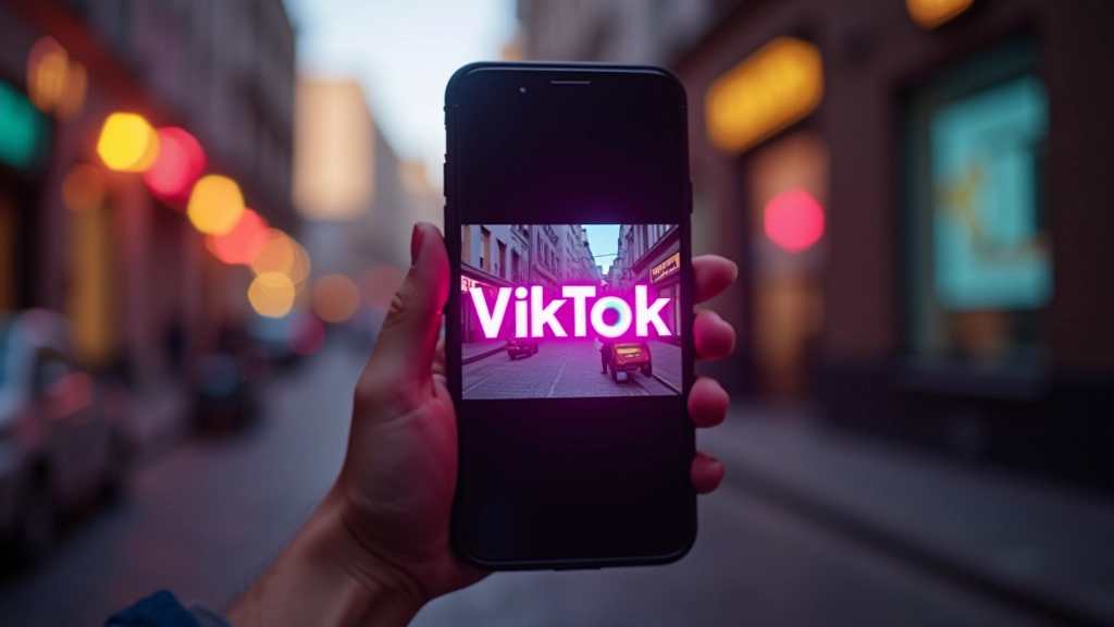
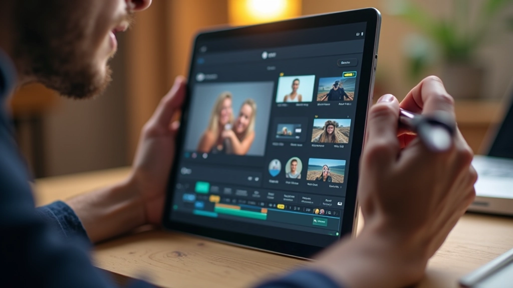
The 9:16 aspect ratio isn’t just a different dimension — it completely reframes what you can do with motion. Horizontal sweeps that work beautifully in landscape suddenly feel cramped. Vertical text that fills a widescreen now looks oddly small. You’re designing for a long, narrow canvas.
This means your motion paths need to respect the vertical space. Zoom effects work better than pans. Quick vertical wipes beat horizontal slides. Text needs to live in the center-upper portion — that’s where thumbs aren’t covering it. Safe zone thinking applies here too.
The best short-form designers actually use the vertical space as a strength. They stack elements, create depth through layering, and use that narrow width to draw focus. Your eye moves vertically through the frame naturally. Design with that in mind, and suddenly those limitations become creative advantages.
Individual learning outcomes vary from person to person. Platform algorithms and user behavior change frequently, so testing your motion designs on actual TikTok and Reels accounts with real audiences is essential for understanding what works for your specific content and followers.
Trending transitions on TikTok and Reels come and go. Right now, we’re seeing a lot of match cuts, 3D flips, and speed ramps. But here’s what doesn’t change: transitions need to feel snappy and motivated. A transition that takes 0.8 seconds feels slow in short-form. You want 0.3 to 0.5 seconds — quick enough to keep pace.
The most effective transitions serve a purpose. They’re not just cool effects — they advance the story or reveal new information. A quick zoom to show detail. A spin to transition between ideas. A fade paired with text that appears. When motion has meaning, it lands harder.
Don’t chase every trend, but do study them. You’ll notice patterns. Fast motion beats slow. Geometric shapes work better than organic curves. Bright, saturated colors grab attention faster than muted tones. These principles stay constant even as specific trends shift.

Most people watch TikTok and Reels without sound. Your phone is probably on silent right now. This fundamentally changes motion design. You can’t rely on audio cues to guide attention. Motion has to do all the heavy lifting. Text overlays become essential — they’re how you communicate when there’s no sound.
This is actually liberating. You get to design pure visual communication. Text that appears with motion. Color shifts that signal meaning. Speed changes that emphasize important moments. No competing with voiceover or background music. Just motion and visuals working together.
When you do use sound (and you should test it), think of it as a bonus layer. The video should work perfectly silent. The sound should enhance, not carry, the message. This mindset produces cleaner, more intentional motion design across the board.
The best way to learn short-form motion design isn’t through tutorials alone — it’s by posting. Create something, watch how people react, adjust, and try again. Your first 10 videos will teach you more than 100 hours of theory.
Focus on those core principles: immediate motion in the first frame, vertical composition thinking, snappy transitions with purpose, and motion that works silent. Build from there. Watch what’s trending in your niche, but don’t chase trends blindly. Adapt them to your style.
Short-form video motion design is fast-moving and constantly evolving. What’s trending changes monthly. But solid fundamentals — clear communication through motion, respect for viewer attention, and intentional design choices — those stay constant. Master the basics, then have fun experimenting with the trends.
Explore more motion design techniques and strategies
Explore timing, easing, and attention-grabbing techniques that drive clicks with responsive animations optimized for desktop and mobile displays.

Learn how to create flexible, adaptable motion templates that save time while maintaining consistent visual branding across multiple platforms.

Track engagement metrics and analyze how motion design elements impact click-through rates and audience retention in paid advertising.