
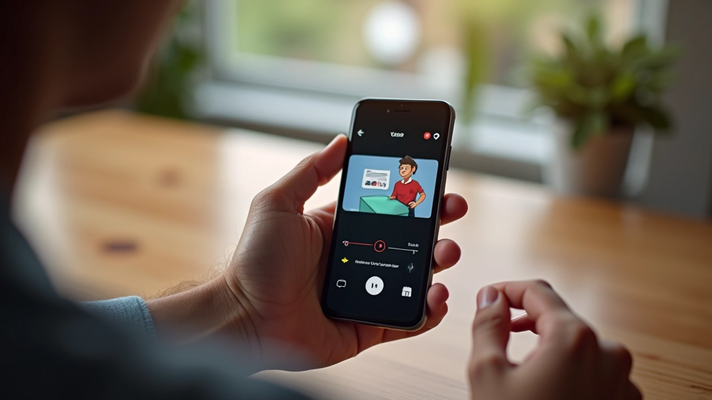
Short-Form Video Motion Design for TikTok and Instagram Reels
Master platform-specific motion requirements. Learn vertical format constraints, trending transitions, and how to design animations that work in feed algorithms.
Read ArticleMaster timing, easing, and attention-grabbing techniques that drive clicks without overwhelming your audience. Learn file size optimization for faster load times.

Author
Editorial Team
Written by the FrameFlow Motion editorial team, focused on practical, clearly explained guidance for motion design and social media animation.
Animated banners aren’t just flashy — they work. A static image gets scrolled past in half a second. Animation? It captures attention. But there’s a balance. You don’t want something so distracting that it annoys people or tanks your page load times.
The real skill is knowing what moves, when it moves, and how fast. We’re talking about principles that have existed in animation for decades, now applied to banner ads. Easing functions, timing, and restraint. Get these right, and you’ll see higher click-through rates. Get them wrong, and your audience clicks away faster than the animation plays.

Duration matters more than you’d think. A banner animation that runs too fast looks cheap. Run it too slow and people leave the page before seeing the message. Most effective banner animations run between 3 and 8 seconds total. That’s not arbitrary — it’s based on how long the average person glances at a banner before deciding to engage or ignore it.
Think of it like pacing in film. You wouldn’t rush through a key plot point. Similarly, each stage of your animation should give viewers time to process what they’re seeing. An element appearing on screen needs about 300-500 milliseconds to register. Text needs longer to read — don’t expect someone to absorb a sentence in under 1 second.

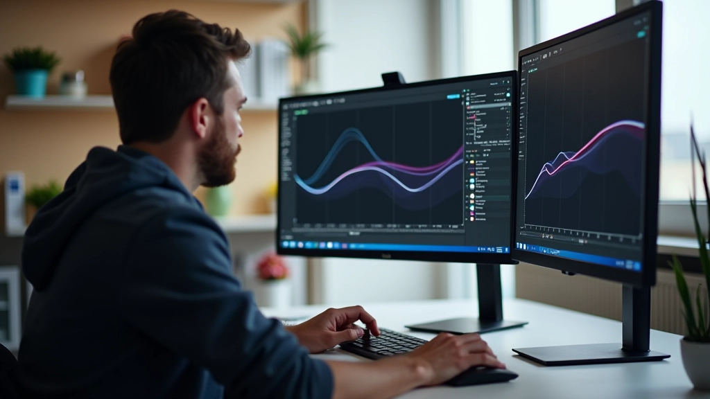
Linear movement looks robotic. Your eye doesn’t experience the world in linear motion — everything accelerates and decelerates. That’s where easing functions come in. Ease-out makes elements feel like they’re slowing down as they arrive. Ease-in makes them feel like they’re speeding up as they leave. Together, they create motion that feels natural and intentional.
The most common choice for banners is ease-out for entrances and ease-in for exits. It’s predictable and comfortable. But there’s room for experimentation. A bouncy easing function (cubic-bezier(0.68, -0.55, 0.265, 1.55)) can add personality without feeling unprofessional. Just use it sparingly — maybe once per banner, for the headline or primary CTA.
Pro tip: Test your animations at different speeds. What feels smooth at 60fps might feel jerky at 30fps on older devices. Always account for lower-end performance.
Educational Note
Individual learning outcomes and animation performance vary from person to person and depend on factors like browser capabilities, device performance, and audience engagement metrics. These guidelines represent best practices, but your specific results will depend on implementation, testing, and real-world audience behavior.
Movement grabs attention. But there’s a fine line between eye-catching and irritating. The secret? Restraint. Don’t animate everything. Animate the most important element — usually the headline or the call-to-action button. Let everything else stay relatively static or move subtly.
Scale, rotation, and color changes are powerful tools. A headline that grows slightly as it appears (from 0.9x to 1.0x) feels engaging without being jarring. A button that changes color on hover creates interaction feedback. A subtle rotation (maybe 2-3 degrees) on an image can add dynamism. But if you’re scaling elements up 50% or rotating them in circles, you’ve crossed from engaging into distracting.
Also consider the context. Banner ads running on a news site should feel professional and measured. The same animation on a gaming site could be more playful. Know your audience and match the energy.

A beautiful animation that takes 8 seconds to load isn’t beautiful anymore. File size directly impacts user experience. CSS animations are lightweight — they’re just code. SVG animations are slightly heavier but still manageable. Video animations? They need careful compression.
For most banner ads, stick with CSS and SVG. Keep your total file size under 150KB if possible — aim for under 100KB for best performance. That means optimizing your images, minifying your CSS, and avoiding unnecessary complexity. If you’re using SVG, export it cleanly and remove any unused paths or attributes.
Test your banners on slower connections. A 4G network or 3G simulation in your browser’s dev tools will show you how your animation performs in the real world. If it stutters or takes too long to load, simplify. Remove unnecessary animations. Reduce color palettes. Compress images more aggressively. Performance isn’t optional — it’s part of good design.

Creating effective ad banner animations comes down to three core principles: respect the viewer’s time with smart timing, use easing functions to create natural motion, and grab attention strategically without being annoying. Add performance optimization into the mix, and you’ve got banners that work.
Start by auditing existing banners you see online. What works? What feels slow or sluggish? What makes you want to click versus scroll away? That observation is your best teacher. Then apply what you learn — build simple animations first, test them, measure click rates, and iterate. The best banner animation is the one that converts, feels natural, and loads fast.
Ready to explore more motion design techniques?
Browse More Resources
Master platform-specific motion requirements. Learn vertical format constraints, trending transitions, and how to design animations that work in feed algorithms.
Read Article
Create modular animation systems that scale across multiple campaigns. Learn how to structure templates, maintain consistency, and speed up production without sacrificing quality.
Read Article
Learn which metrics actually matter — engagement, completion rates, and click-through performance. Discover how to A/B test animations and make data-driven improvements.
Read Article